Guide
Table of contents
Overview
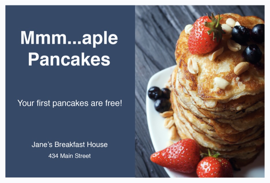
Mailjoy opens up personalization capabilities for direct mail that weren't previously possible. This means you can personalize text and images on each postcard with each recipients' own data. We no longer offer the ability to code postcards in HTML as we've rolled out features to effortlessly design and personalize postcards without having to write any code.
Skip this guide and instead check out our other guides on how to get started and how to design postcards that convert.
P.S. - Looking for inspiration? Check out our free postcard templates which you can customize for your own campaign.
Postcard and format
Our two supported formats today are 4” x 6” and 11” x 6”. While the sizes are slightly different, the terminology and development methods are the same. Each postcard consists of both a front and a back side. You have full design control over both, but only the front is actually required.

Key terms
- Bleed size - This is extra space that is added to the mailer to compensate for slight variations in where the printer separates the cards. Since your creatives will run edge to edge, the bleed is generally best as an image or border. Text should never reach this area.
- Actual size - This is the actual postcard once it's cut down to size.
- Safe size - To ensure no text is cut off, we cite a safe size so that the text doesn't run to the edge.

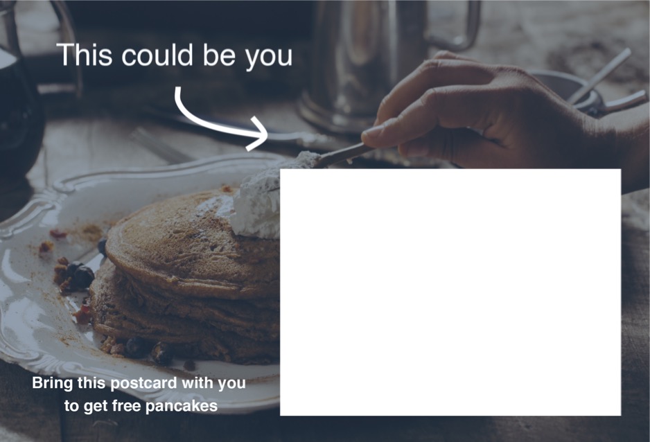
The back side is identical to the front with respect to the different sections, but it also contains an ink-free section for the address, postage, and barcode tracking. Do not put any content in this area as our printer will automatically overlay this section above your design. You’ll need to design around it.
Template overview
Every time you create a new campaign, the default mailer design is based on the default HTML template. Both the front and back have different templates, and the templates vary between mailer sizes.
For demonstrative purposes, here’s the back template for a 4x6 postcard.
<!DOCTYPE html>
<html>
  <head>
    <meta charset="UTF-8">
    <link href="[[back_fonturl]]" rel="stylesheet" type="text/css">
    <title></title>
    <style>
        *, *:before, *:after { -webkit-box-sizing: border-box; -moz-box-sizing: border-box; box-sizing: border-box; font-family: [[back_fontfamily]]; }
        html { background-color: transparent; overflow: hidden; }

        /* The body section defines the whole size of the postcard and some basic properties. */
        body { width: 6.25in; height: 4.25in; margin: 0; padding: 0; font-size: 12px; line-height: 20px; overflow: hidden; }

        /* The card section defines positioning and the overall background of the postcard. */
        #card { position: absolute; left: 0; top: 0; right: 0; bottom: 0; background-color: white; background-image: url('[[back_background]]'); background-size: 100%; background-repeat: no-repeat; overflow: hidden; }

        /* The safe area defines where your content — especially text — should be contained. Note: You can let your content extend beyond this — i.e. images — but know that some of it may get cut off in the bleed. Modifying this section is not recommended.*/
        #safe-area { position: fixed; left: 0.1875in; right: 0.1875in; top: 0.1875in; bottom: 0.1875in; word-wrap: break-word; }

        /* The ink-free section only applies to the back of a design. You should always design around this as our printer will insert this block over your design in this specific area. You can see it by clicking "Show print guidelines" when in Preview mode. Modifying this section is not recommended. */
        #ink-free { position: absolute; width: 53%; height: 58%; right: 3%; bottom: 4.5%; background-color: rgba(255,255,255,0.0); }

        /* Our default back template features a message block that non-technical users can type into from the visual editor. Feel free to remove this section if your design doesn't need it.*/
        #message { position: absolute; width: 2.4in; height: 100%; padding-left: .05in; overflow: hidden; white-space: pre-line; }
    </style>
  </head>
  <body>
    <div id="card">
      <div id="safe-area">
        <!-- This is an editable message from the visual designer. If it doesn't fit your template, feel free to remove the <div> and mergefield -->
        <div id="message">
          [[message]]
        </div>
      </div>
      <div id="ink-free"></div>
    </div>
  </body>
</html>
You’ll notice each of the three regions described above:
body{width:6.25in;height: 4.25in;margin:0;padding:0;font-size: 12px; line-height: 20px;}This is the body section which defines the whole size of the postcard and some basic properties.
#card { position: absolute; left: 0; top: 0; right: 0; bottom: 0; background-color: white; overflow: hidden; }This is the card section which defines overall positioning.
#safe-area{position: fixed;left:0.1875in;right:0.1875in;top:0.1875in;bottom:0.1875in;}This is the safe area which defines where your content — especially text — should be contained. Note: You can let your content extend beyond this — i.e. images — but know that some of it may get cut off in the bleed.
#ink-free{position: absolute; width: 53%; height: 58%; right: 3%; bottom: 4.5%; background-color: rgba(255,255,255,0.0);}This is the ink-free section which only applies to the back of a design. You should always design around this as our printer will insert this block over your design in this specific area.
HTML and stylesheets
Stylesheets should always be provided inline. Linking to external stylesheets will not work.
Images
Currently, we don’t support local hosting of images meaning you’ll need to link offsite to your images. It’s vital that you test that these images work before purchasing your campaign. While we do some validations on our end, it’s up to you to make sure the referenced links are valid. Once purchased, your campaign moves in a processing state. Until we acknowledge that the campaign has moved from processing to sent, your images need to remain available. Once sent, our printer stores the content locally.
If you’re sending a high volume campaign, we recommend you host the content yourself on a performant file hosting provider such as Amazon S3 and send us a URL to the content in your API request.
When using PNGs or JPEGs, we recommend a minimum of 300 dpi to ensure the highest print quality. The dpi is calculated as (width of image in pixels) / (desired width in postcard in inches) and (length of image in pixels) / (desired length in postcard in inches). For example: 1275px x 1875px image used for a 4.25" x 6.25” postcard’s background design has a dpi of 300.
Fonts
Custom fonts can be used, but they need to be provided inline. Here’s an example to the Google hosted web font ‘Source Sans Pro’:
<link href="https://fonts.googleapis.com/css?family=Source+Sans+Pro:400,600,700" rel=“stylesheet” type=“text/css”>Positioning
Unlike email, coding for print design is within a perfectly defined region. There’s no mobile vs desktop constraints or browser specific environments to worry about. The total size of the region is based on the size of the mailer you choose. Because of this, you can confidently use absolute positioning. We recommend using inches when working with positioning.
#image{position: absolute; left: 1.5in; top: .5in;}Sizes
For font sizes you can use any unit you want, but we recommend px or in.
Colors
Due to the color gamut we work with, we recommend only using solid colors as gradients may not print as precisely as they show on-screen.
Previewing vs print
To ensure your printed mailer looks like what you see on-screen, we handle conversion between the scenes. It’s kind of like magic, really. While you can immediately preview your designs, it’s your responsibility to ensure that your mailers are accurate before checking out. Due to rendering differences, there may also be very slight differences between your preview and what’s printed. You can always send yourself an actual mailer too to see things in person before ramping up a large campaign. If you have questions, just contact us.
Using an HTML template
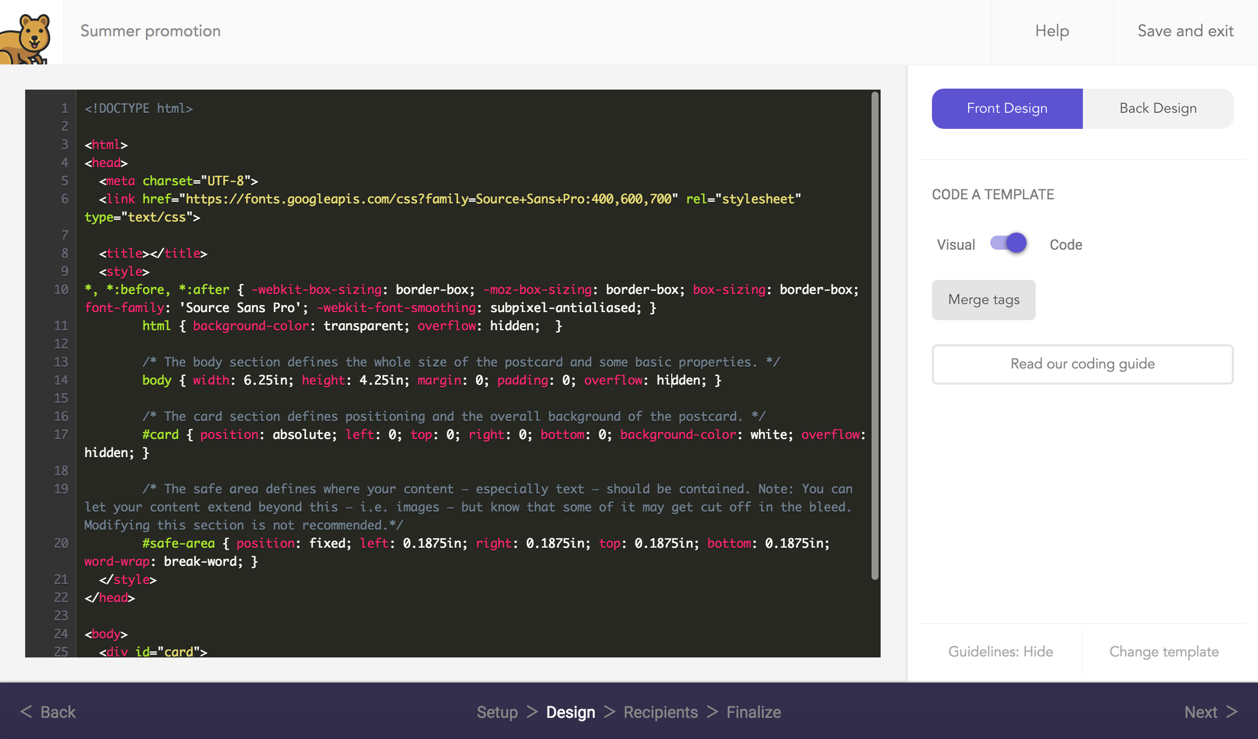
The HTML editor can only be accessed by selecting Code a design in HTML as your desired template.You can find this template under the Other category in template selection. In the HTML editor, the functionality of our self-service design tool is not available. This means all elements of your design must come from code that you write.
The HTML editor is a lightweight tool to help you code mailers quickly and properly. Initially, you’ll notice the default template’s code which you can start modifying right aware. Remember: Each side of a postcard can use a different template.

Validation and previewing
Previewing in the editor will render your HTML. If there are issues, we’ll let you know in the editor as your mailer may not preview properly. When in design mode, your inline preview will show merge tag names. To see them converted with live recipient data, you’ll need to go to the preview page.
Resetting the template
If you want to start working from the default template again, simply click Change template and then reselect it.
Merge tags
The ability to personalize each mailer at scale is what makes Mailjoy so powerful. By creating HTML generated templates, you’re able to merge all different kinds of data. You can include an available merge tag in the format {{mergetag}} and we’ll convert that to the associated data for each mailer.
Hello {{firstname}}!If we had a recipient named John Doe, the above would return "Hello John!"
To see the full list of merge tags, see our help center article
Note: Any merge tags' content can be no more than 500 characters in length.
HTML templates
4" x 6" Front
<!DOCTYPE html>
<html>
  <head>
    <meta charset="UTF-8">
    <link href="https://fonts.googleapis.com/css?family=Source+Sans+Pro:400,600,700" rel="stylesheet" type="text/css">
    <title></title>
    <style>
        *, *:before, *:after { -webkit-box-sizing: border-box; -moz-box-sizing: border-box; box-sizing: border-box; font-family: 'Source Sans Pro'; -webkit-font-smoothing: subpixel-antialiased; }
        html { background-color: transparent; overflow: hidden;  }

        /* The body section defines the whole size of the postcard and some basic properties. */
        body { width: 6.25in; height: 4.25in; margin: 0; padding: 0; overflow: hidden; }

        /* The card section defines positioning and the overall background of the postcard. */
        #card { position: absolute; left: 0; top: 0; right: 0; bottom: 0; background-color: white; background-image: url('[[front_background]]'); background-size: 100%; background-repeat: no-repeat; overflow: hidden; }

        /* The safe area defines where your content — especially text — should be contained. Note: You can let your content extend beyond this — i.e. images — but know that some of it may get cut off in the bleed. Modifying this section is not recommended.*/
        #safe-area { position: fixed; left: 0.1875in; right: 0.1875in; top: 0.1875in; bottom: 0.1875in; word-wrap: break-word; }
    </style>
  </head>
  <body>
    <div id="card">
      <div id="safe-area">

      </div>
    </div>
  </body>
</html>
4" x 6" Back
<!DOCTYPE html>
<html>
  <head>
    <meta charset="UTF-8">
    <link href="https://fonts.googleapis.com/css?family=Source+Sans+Pro:400,600,700" rel="stylesheet" type="text/css">
    <title></title>
    <style>
        *, *:before, *:after { -webkit-box-sizing: border-box; -moz-box-sizing: border-box; box-sizing: border-box; font-family: 'Source Sans Pro'; -webkit-font-smoothing: subpixel-antialiased; }
        html { background-color: transparent; overflow: hidden; }

        /* The body section defines the whole size of the postcard and some basic properties. */
        body { width: 6.25in; height: 4.25in; margin: 0; padding: 0; font-size: 12px; line-height: 20px; overflow: hidden; }

        /* The card section defines positioning and the overall background of the postcard. */
        #card { position: absolute; left: 0; top: 0; right: 0; bottom: 0; background-color: white; overflow: hidden; }

        /* The safe area defines where your content — especially text — should be contained. Note: You can let your content extend beyond this — i.e. images — but know that some of it may get cut off in the bleed. Modifying this section is not recommended.*/
        #safe-area { position: fixed; left: 0.1875in; right: 0.1875in; top: 0.1875in; bottom: 0.1875in; word-wrap: break-word; }

        /* The ink-free section only applies to the back of a design. You should always design around this as our printer will insert this block over your design in this specific area. You can see it by clicking "Show print guidelines" when in Preview mode. Modifying this section is not recommended. */
        #ink-free { position: absolute; width: 53%; height: 58%; right: 3%; bottom: 4.5%; background-color: rgba(255,255,255,0.0); }

    </style>
  </head>
  <body>
    <div id="card">
      <div id="safe-area">

      </div>
      <div id="ink-free"></div>
    </div>
  </body>
</html>
11" x 6" Front
<!DOCTYPE html>
<html>
  <head>
    <meta charset="UTF-8">
    <link href="https://fonts.googleapis.com/css?family=Source+Sans+Pro:400,600,700" rel="stylesheet" type="text/css">
    <title></title>
    <style>
        *, *:before, *:after { -webkit-box-sizing: border-box; -moz-box-sizing: border-box; box-sizing: border-box; font-family: 'Source Sans Pro'; -webkit-font-smoothing: subpixel-antialiased; }
        html { background-color: transparent; overflow: hidden; }

        /* The body section defines the whole size of the postcard and some basic properties. */
        body { width: 11.25in; height: 6.25in; margin: 0; padding: 0; overflow: hidden; }

        /* The card section defines positioning and the overall background of the postcard. */
        #card { position: absolute; left: 0; top: 0; right: 0; bottom: 0; background-color: white; background-image: url('[[front_background]]'); background-size: 100%; background-repeat: no-repeat; overflow: hidden; }

        /* The safe area defines where your content — especially text — should be contained. Note: You can let your content extend beyond this — i.e. images — but know that some of it may get cut off in the bleed. Modifying this section is not recommended.*/
        #safe-area { position: fixed; left: 0.1875in; right: 0.1875in; top: 0.1875in; bottom: 0.1875in; word-wrap: break-word; }
    </style>
  </head>
  <body>
    <div id="card">
      <div id="safe-area">

      </div>
    </div>
  </body>
</html>
11" x 6" Back
<!DOCTYPE html>
<html>
  <head>
    <meta charset="UTF-8">
    <link href="https://fonts.googleapis.com/css?family=Source+Sans+Pro:400,600,700" rel="stylesheet" type="text/css">
    <title></title>
    <style>
        *, *:before, *:after { -webkit-box-sizing: border-box; -moz-box-sizing: border-box; box-sizing: border-box; font-family: 'Source Sans Pro'; -webkit-font-smoothing: subpixel-antialiased; }
        html { background-color: transparent; overflow: hidden; }

        /* The body section defines the whole size of the postcard and some basic properties. */
        body { width: 11.25in; height: 6.25in; margin: 0; padding: 0; font-size: 20px; line-height: 30px; overflow: hidden; }

        /* The card section defines positioning and the overall background of the postcard. */
        #card { position: absolute; left: 0; top: 0; right: 0; bottom: 0; background-color: white; overflow: hidden; }

        /* The safe area defines where your content — especially text — should be contained. Note: You can let your content extend beyond this — i.e. images — but know that some of it may get cut off in the bleed. Modifying this section is not recommended.*/
        #safe-area { position: fixed; left: 0.1875in; right: 0.1875in; top: 0.1875in; bottom: 0.1875in; word-wrap: break-word; }

        /* The ink-free section only applies to the back of a design. You should always design around this as our printer will insert this block over your design in this specific area. You can see it by clicking "Show print guidelines" when in Preview mode. Modifying this section is not recommended. */
        #ink-free { position: absolute; width: 53%; height: 58%; right: 3%; bottom: 4.5%; background-color: rgba(255,255,255,0.0); }

    </style>
  </head>
  <body>
    <div id="card">
      <div id="safe-area">

      </div>
      <div id="ink-free"></div>
    </div>
  </body>
</html>
