Guide
Table of contents
Overview
Mail — yes, real physical mail — is something nearly everyone gets, but not all mail is created equal. We’ve all received mail that looks like it was designed in Microsoft Paint sometime during the 90’s. If you’re sending mail today, you can’t afford to be that kind of company. Consumer expectations around design are far greater today, and how you market is a reflection of that. While some mail may be personal in nature, many companies use mail as a marketing channel to either acquire new customers or reengage customers they already have in hopes of driving more revenue. When executed properly, mail can result in ROI that far exceeds email. This is especially true for companies that have customers with high lifetime value (LTV).
Postcard marketing refers to direct mail that uses postcards as the mailer format. Postcards have a front and back design, and unlike stuffed mail you have to open, the mailer’s message is immediately present. In this guide we’ll cover strategy and design principles behind simple, yet effective, postcard marketing designs that convert.
Postcard usecases
There’s really an endless number of ways you can use postcards, but here are some of our favorites:
- Promoting a sale to existing customers.
- Acquiring customers in new markets when launching a local product/service.
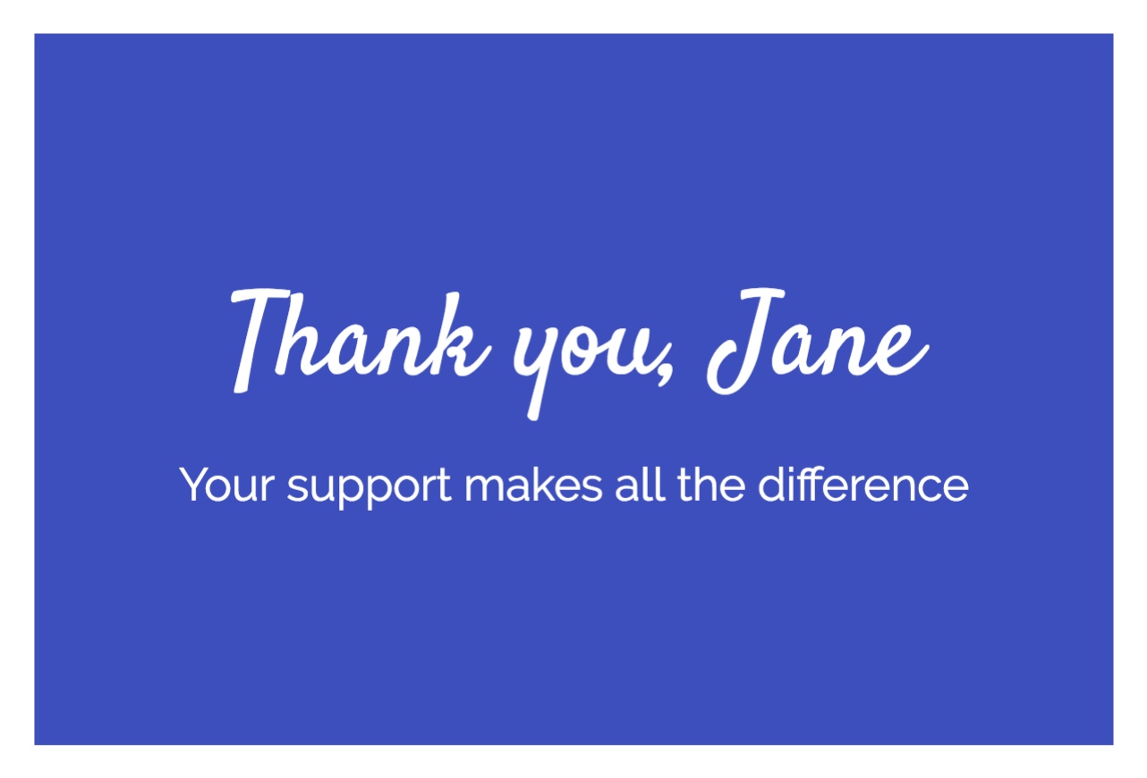
- Sending thank you notes or holiday cards to customers.
- Advocating a cause.
- Realtors promoting properties sold nearby.
- Inviting prior attendees to a new upcoming event.
Design strategy
Creating an effective mailer that drives results is more than just creating something that looks nice. It needs to be relevant to the recipient, have easy to understand copy, and show a clear call to action. These are some general strategy questions you should start with each time:
What size should we use?
The postcard size will matter when it comes to making your mailer stand out from other mail in a mailbox. Odd sizes and typically ones that are bigger will stand out more than others. This can be helpful for recipients who might not know about your brand. However, the larger the postcard, the more expensive it is. For the right campaign, this can make the difference as you have more space to work with.
Should we personalize the content?
If you have relevant data to personalize a mailer, you should. For new potential customers, the ability to personalize depends on whether it’s a targeted campaign (specific recipients are known) or an area mail (covers a whole region with no specific recipients) campaign. For existing customers, consider data from your CRM.
Do we have a relationship with the recipient?
If a recipient knows your brand, you have more flexibility in the messaging. With existing customers, you can do this, but for new potential customers, you should assume they’ve never heard of you. This is why it’s important to say what you do in simple, short, jargon-free phrasing.
What are we offering to drive immediate action?
There needs to be something compelling for the recipient to take immediate action. This could be anything from money off the purchase price of your product to a trial offer for your service. Ideally, the offer is time-boxed so there's urgency to act sooner rather than later.
What’s my call to action and how will I track the results?
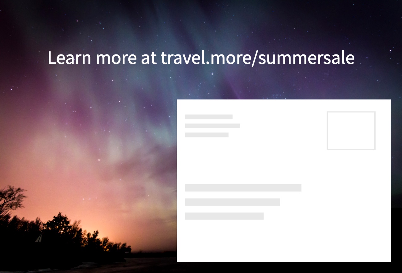
A clear call to action is essential for two reasons: 1) it tells the customer what to do 2) it lets you track the results of a campaign. There should only be a single call to action. Some examples include “Get $10 off when you use this code” or “Go to this page to signup.”
Designing for conversion
The postcards that convert the most don't just look great, but also feature a variety of elements to effectively communicate their message and drive action to some measurable goal.
Keep it simple
Less is more when it comes to postcard design. Rather than cram in loads of images and text, keep things simple. This may seem counterintuitive, but the more you include, the more a recipient has to process. The goal is to drive action. Get your recipient’s attention, deliver the most important information, and then make it easy for them to complete your desired action.

Craft a great headline
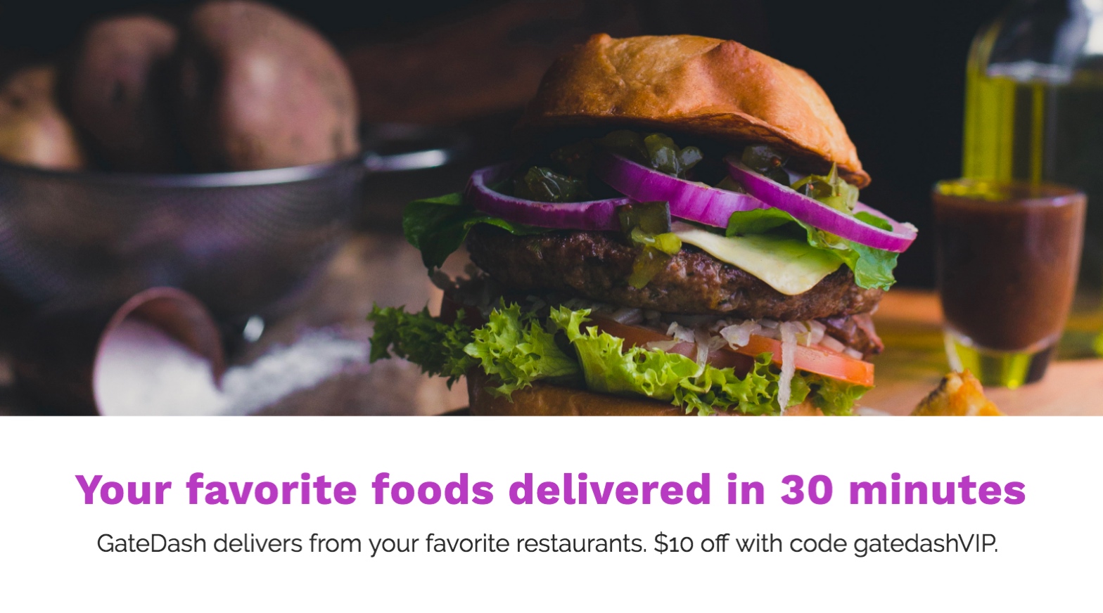
The headline is the hook. It’s what makes the recipient stop to think or do a double take. Great headlines should be clear, concise, and compelling. It should be the largest text on the postcard’s front side.

Use high-quality imagery
Great imagery supports your message, helps your postcard stand out, and can even elicit a positive emotional response. The images you choose merit careful consideration. Avoid overly stock-looking photos and ensure the photos are high enough resolution for print (300 dpi). The quality you see on your screen may not be reflective of the actual print quality.
Check out resources like Unsplash, Stocksy, and Pixabay to find high quality, print-friendly imagery. Try to make sure your image does one thing well, rather than trying to capture every aspect of your copy.
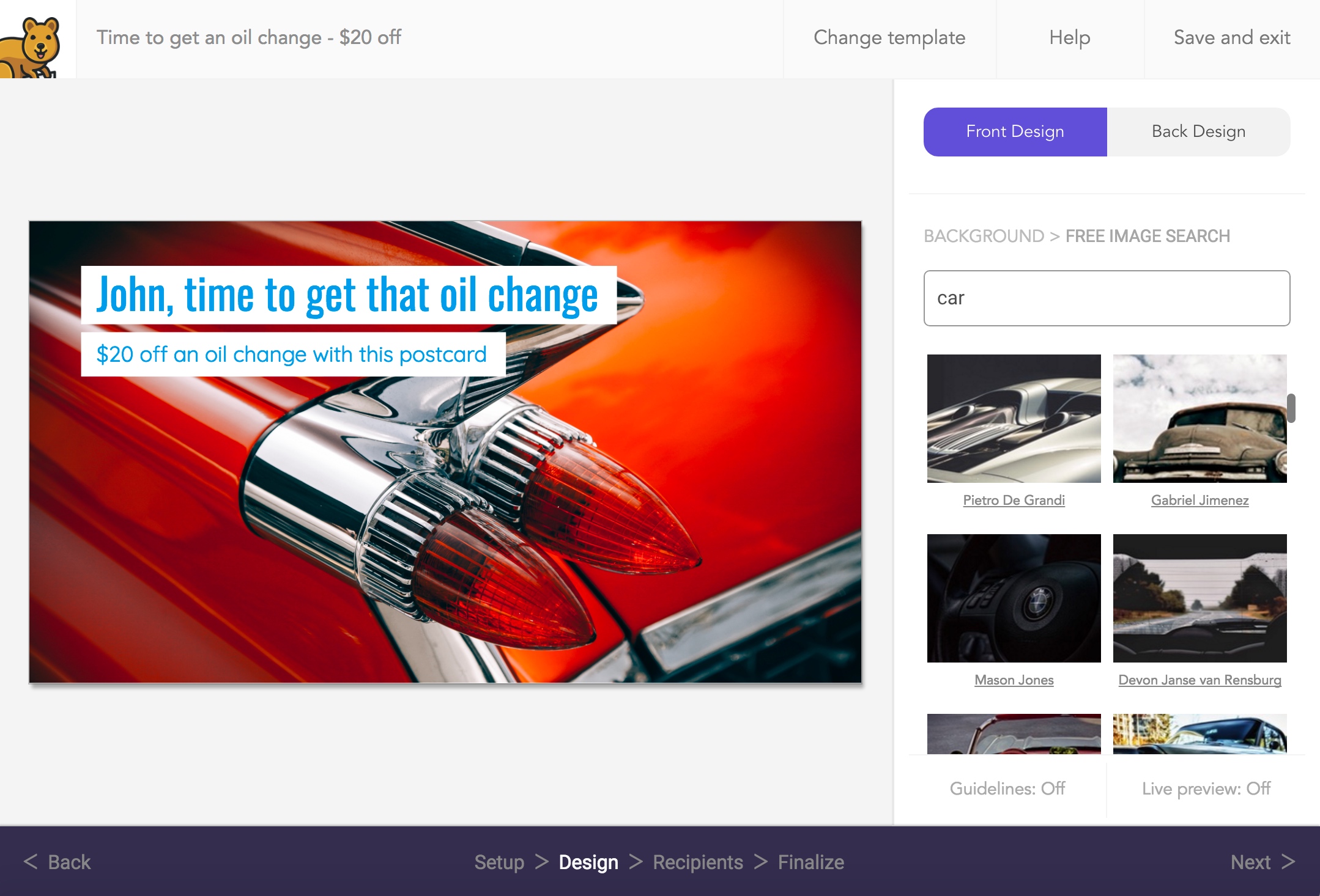
Note: Our self-service postcard design tool has Unsplash natively integrated so you can search and preview 200k+ free images for your design!

Personalize with data
Personalization drives results. It makes the experience feel relevant to the recipient and that the postcard was designed for them, rather than the lowest common denominator. You should use available recipient data to personalize their postcard. This could be things like their first name, a recent product they purchased, a custom url or promo code, or their company name.
Tip: You'll need to find a printer or special software to do this. Mailjoy makes this as easy as using merge tags like {{firstname}} for any of your recipients.

Promote a compelling offer
Compelling offers drive action. While having an offer isn’t always required, it can help drive urgency to your call-to-action. For example, consider infomercials who drive immediate action by showcasing a “great” offer that’s only available for a limited time.

Have a single, clear call to action
You should only include a single call-to-action that’s easy to complete. Sure, you may want the recipient to visit your website, follow you on Facebook, and make a purchase, but the goal of your postcard is to drive some sort of response. Pick the one that aligns most with your desired campaign goals, then make it stand out.

Track and attribute the results
Regardless of your call-to-action, it should be trackable so you can attribute the results to your campaign. Here are some examples of how to track:
Measuring website views
How to track: Send recipients to a landing page with a unique URL that's created just for the direct mail campaign. In an analytics tool like Google Analytics you'll be able to see how much traffic came from the campaign.
Measuring signups
How to track: Offer a unique invite or promotional code that needs to be used at signup. You can then attribute all signups to the campaign.
Measuring purchases
How to track: Offer a unique discount code that needs to be used at checkout. You can then attribute all purchases to the campaign.
Measuring phone calls
How to track: Use a call forwarding number system that lets you create unique phone numbers for marketing campaigns. You can then attribute all calls to that number to the campaign.
Where to design a postcard
These tips apply to whether you're hiring a graphic designer or doing it yourself. If you're looking for an easy way to design postcards yourself, checkout Mailjoy (the site you're on!) or Canva. We also offer free-to-use templates that incorporate these best practices.
Regardless of how you create your postcard design, when it's ready to go simply use Mailjoy to create a mail campaign. It's DIY and you'll be able to send personalized, data-driven campaigns with your own design in minutes! Sign up now for free.
Ready to get started?
Create a free account to mail your first postcard or letter campaign in minutes, and unlock a new way to acquire and engage customers.
Simple pricing.
No surprises.
Whether you're just starting with mail or are already a pro, we make it easy with flat-rate PAYG pricing and discounted credit plans.
Start quickly.
Look professional.
Customize any of our free beautiful templates with your details, and get your campaign sent of in a matter of minutes.
